Loyalty Widget
Loyalty Widget
Introduction
The myCred Loyalty Widget is a floating, interactive rewards panel that displays on the front end of your WooCommerce site. Logged-in members can view their points balance, browse redemption options, check the leaderboard, review transaction history, see their badges and rank, and more — all without leaving the page they are on.
This document covers every admin setting available under myCred → Loyalty Widget, grouped by the five tabs: General, Design, Content, Tabs, and Event Triggers. Each setting is shown with a high-resolution screenshot and a plain-language explanation
How to Access
Log in to your WordPress dashboard. In the left-hand menu, go to myCred → Loyalty Widget. Five sidebar items appear: General, Design, Content, Tabs, and Event Triggers.
General Settings
The General tab controls whether the widget is active, where it appears on screen, and whether it should only show during a specific time window.
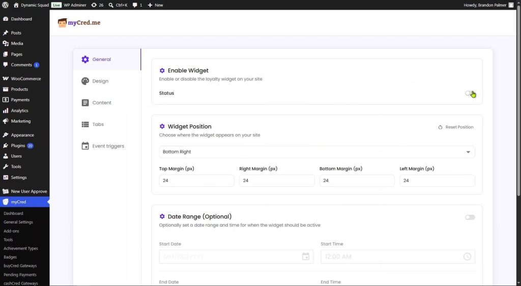
General Settings — Enable Widget and Widget Position
Enable Widget
This is the master on/off switch for the entire loyalty widget.
| Setting | Description |
| Status | Toggle ON to make the widget visible on the front end. Toggle OFF to hide it completely without deleting any settings. |
Turning this OFF removes the widget from every page instantly. All design, content, and tab settings are preserved — toggling back ON restores everything immediately.
Widget Position
Determines where the launcher button and widget panel appear on screen.

Widget Position dropdown and all four margin fields
| Setting | Description |
| Position dropdown | Choose Bottom Right, Bottom Left, Top Right, or Top Left. Bottom Right is the default and works well for most store layouts. |
| Reset Position | Resets the position to Bottom Right and all margins back to 24 px. |
| Top Margin (px) | Distance in pixels between the widget and the top edge of the viewport. Active only for top-positioned variants. |
| Right Margin (px) | Distance in pixels from the right edge. Active only for right-positioned variants. |
| Bottom Margin (px) | Distance in pixels from the bottom edge. Active only for bottom-positioned variants. |
| Left Margin (px) | Distance in pixels from the left edge. Active only for left-positioned variants. |
The default margin for all four sides is 24 px. Increase these values if a cookie banner, live chat button, or other fixed element overlaps the widget launcher.
Date Range (Optional)
Schedule the widget to appear only during a specific window — ideal for promotions, seasonal campaigns, or time-limited loyalty events.

Date Range toggle enabled showing Start Date/Time and End Date/Time fields
| Setting | Description |
| Date Range toggle | Enable this to reveal the date and time fields. While OFF, the widget runs indefinitely whenever the Status toggle is ON. |
| Start Date | Calendar date the widget begins showing. Format: MM/DD/YYYY. |
| Start Time | Time the widget goes live on the Start Date. Defaults to 12:00 AM (start of day). |
| End Date | Calendar date the widget stops showing. |
| End Time | Time the widget stops on the End Date. Defaults to 11:59 PM (end of day). |
Example: for a Black Friday campaign, set Start Date to Nov 28 at 12:00 AM and End Date to Nov 29 at 11:59 PM. The widget appears and disappears automatically with no manual action required.
Design Settings
The Design tab controls the visual appearance of the widget: logo, colors, branding, and the launcher button. A live preview panel on the right updates in real time as you make changes.

Design tab — Logo Settings, Appearance colors, and Live Widget Preview
Logo Settings
| Setting | Description |
| Show Logo | Toggle ON to display a logo in the widget header. Toggle OFF to show only the “myCred rewards” text title. |
| Upload Logo | Click Choose file to upload a custom image (PNG or SVG recommended). The uploaded file URL appears next to the button once saved. |
| Restore Default | Removes any custom logo and reverts to the default myCred coin icon. |
Recommended: keep the logo under 200 px tall. Use a PNG with a transparent background so it blends with any background color.
Appearance
Four color pickers let you fully brand the widget to match your site.
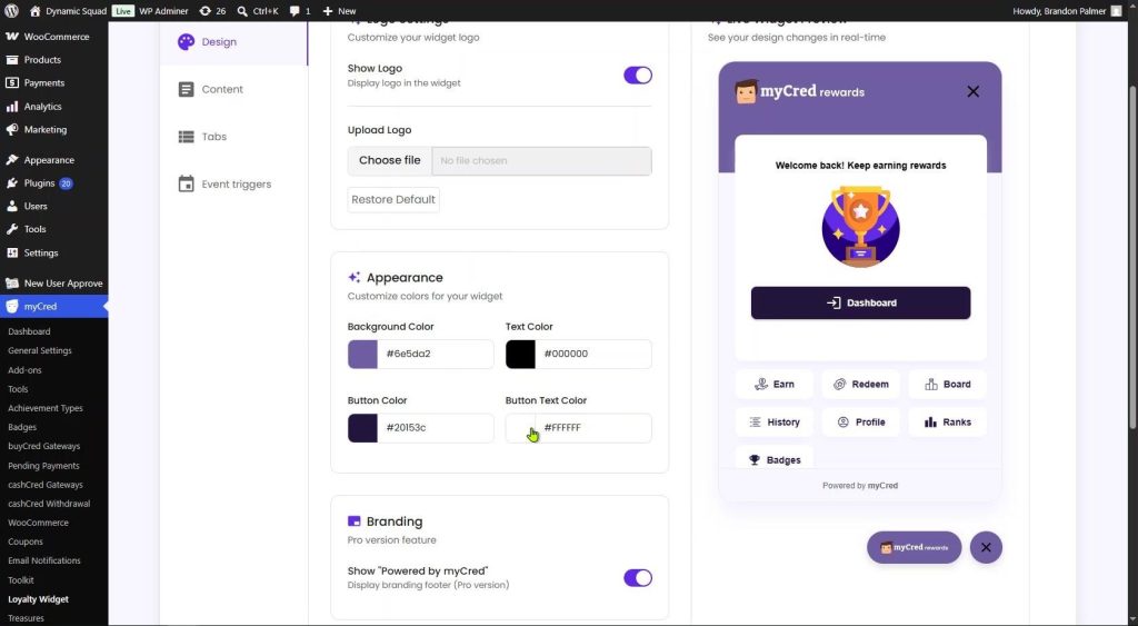
Appearance color pickers (background, text, button, button text) and Branding section
| Setting | Description |
| Background Color | Main background color of the widget header. Default is deep purple (#2D1572). |
| Text Color | Color of text and icons in the widget header and navigation. Default is #5E2CED. |
| Button Color | Background color of the primary action button (Dashboard, Join Now). Default is #5E2CED. |
| Button Text Color | Label color on primary buttons. Default is white (#FFFFFF). |
Click any color swatch to open the inline color picker, or type a hex code directly. Changes are reflected instantly in the Live Widget Preview panel.
Branding

Branding toggle and Launcher Button Settings in the right-side live preview
| Setting | Description |
| Show “Powered by myCred” | Toggle OFF to remove the “Powered by myCred” footer link from the bottom of the widget panel. Pro version feature. |
Launcher Button Settings
These settings control the floating launcher button that opens the widget when clicked.
| Setting | Description |
| Button Radius (px) | Slider controlling corner rounding of the launcher button. Fully left = square; fully right = rounded pill/circle. |
| Opening Animation | Animation when the widget panel opens. Options: Fade, SlideUp, SlideDown, SlideLeft, SlideRight. |
| Reset to Defaults | Resets button radius and animation back to factory defaults. |
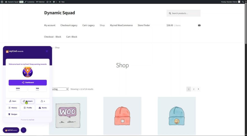
Front-end view: widget open on a WooCommerce shop page showing the full panel with all navigation tabs
Content Settings
The Content tab lets you customize every piece of text inside the widget panel. It has two sub-tabs — Guest User (for visitors who are not logged in) and Member (for logged-in users). Each sub-tab contains four collapsible sections.
Guest User Tab
Controls what non-logged-in visitors see when they open the widget.
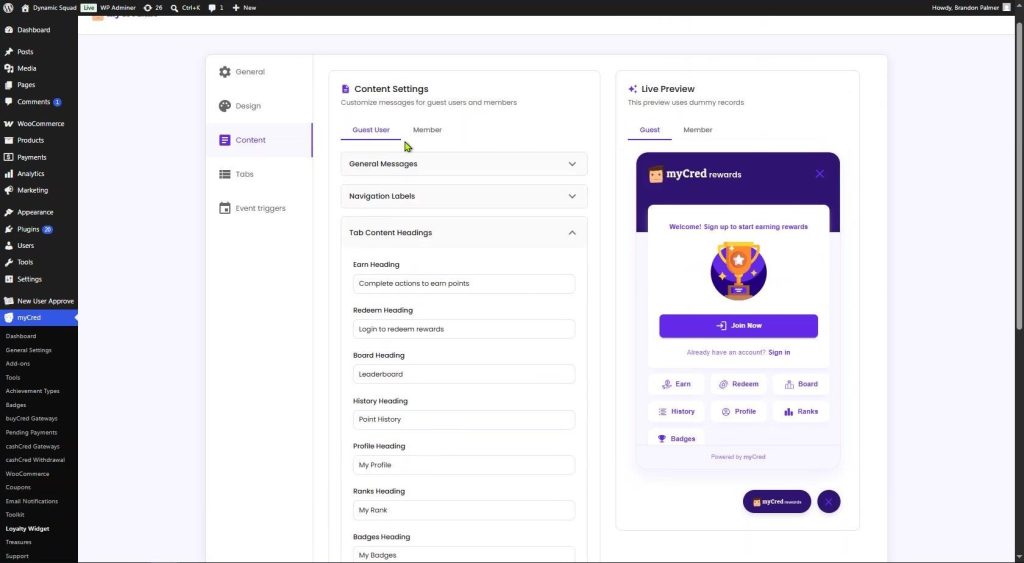
Content Settings — Guest User sub-tab with General Messages and live Guest preview
General Messages
| Setting | Description |
| Welcome Message | The headline text shown to guest visitors in the widget body. Default: “Welcome! Sign up to start earning rewards.” |
Navigation Labels
Labels displayed beneath each icon in the bottom navigation bar of the open widget.
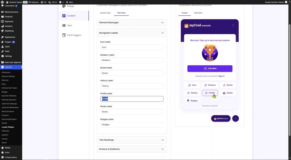
Navigation Labels section with all seven label fields expanded
| Setting | Description |
| Earn Label | Label for the Earn tab icon. Default: “Earn”. |
| Redeem Label | Label for the Redeem tab icon. Default: “Redeem”. |
| Board Label | Label for the Board (leaderboard) tab icon. Default: “Board”. |
| History Label | Label for the point history tab icon. Default: “History”. |
| Profile Label | Label for the user profile tab icon. Default: “Profile”. |
| Ranks Label | Label for the user rank tab icon. Default: “Ranks”. |
| Badges Label | Label for the achievements/badges tab icon. Default: “Badges”. |
Tab Content Headings
The headline text shown at the top of each tab when a user opens it.
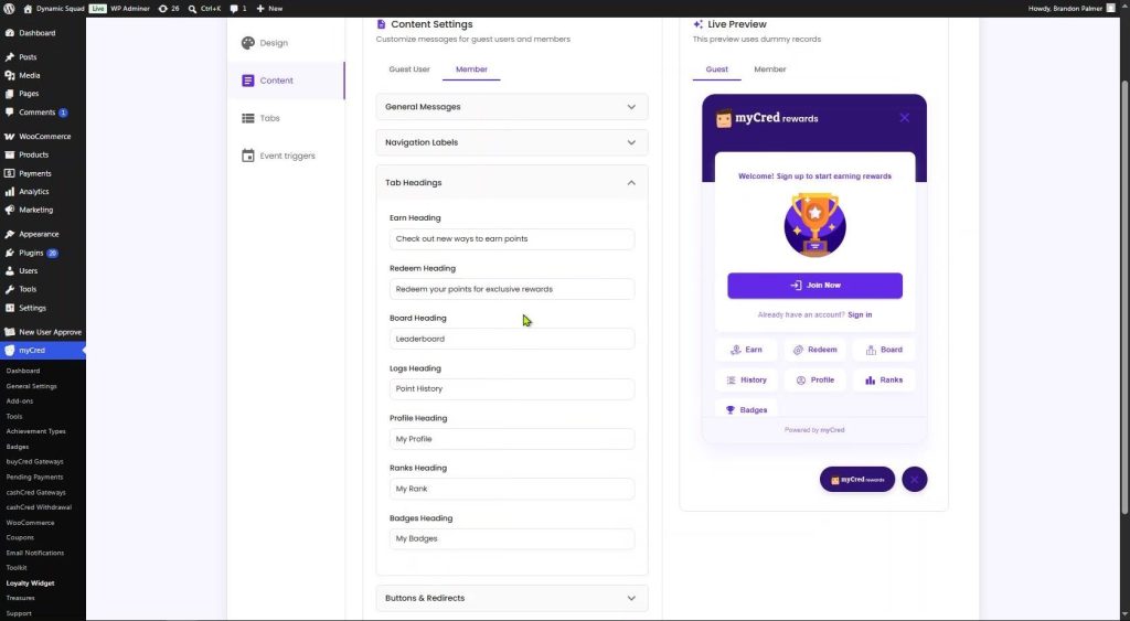
Tab Headings section with all seven heading fields
| Setting | Description |
| Earn Heading | Heading inside the Earn tab. Default: “Check out new ways to earn points”. |
| Redeem Heading | Heading inside the Redeem tab. Default: “Redeem your points for exclusive rewards”. |
| Board Heading | Heading inside the Board tab. Default: “Leaderboard”. |
| History Heading | Heading inside the History/Logs tab. Default: “Point History”. |
| Profile Heading | Heading inside the Profile tab. Default: “My Profile”. |
| Ranks Heading | Heading inside the Ranks tab. Default: “My Rank”. |
| Badges Heading | Heading inside the Badges tab. Default: “My Badges”. |
Buttons & Redirects
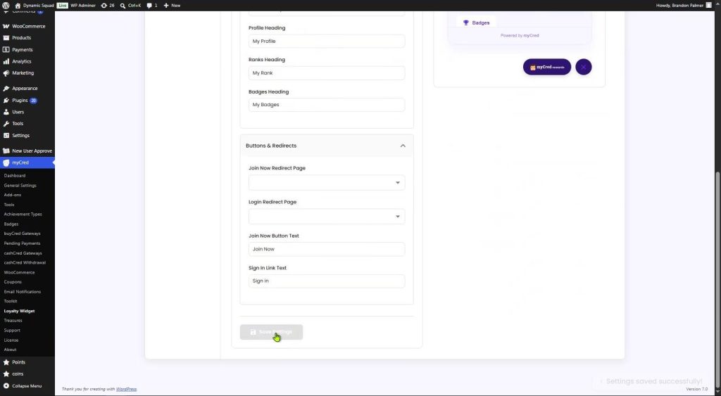
Buttons & Redirects section with page dropdowns and button text fields
| Setting | Description |
| Join Now Redirect Page | The WordPress page guests are sent to when they click “Join Now”. Typically your registration or sign-up page. |
| Login Redirect Page | The page guests are sent to when they click “Sign in”. Typically your login page. |
| Join Now Button Text | Label on the call-to-action button shown to guests. Default: “Join Now”. |
| Sign In Link Text | Label on the login link shown below the Join Now button. Default: “Sign in”. |
Member Tab
Identical structure to the Guest User tab, but all settings apply to logged-in members. The Welcome Message field supports the {user} placeholder to display the member’s username (e.g., “Welcome back {user}! Keep earning rewards”).
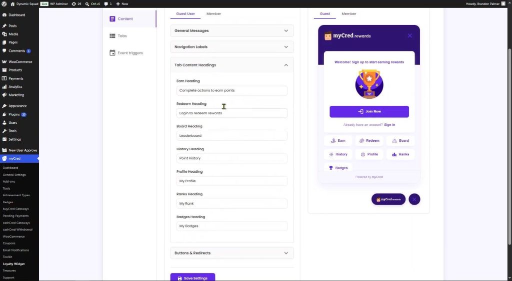
Member tab — Guest User sub-tab showing Tab Content Headings for the guest view
Tabs Settings
The Tabs section controls which navigation tabs are shown inside the widget and provides detailed configuration for the Board (leaderboard) tab.
Tab Controls
Toggle individual tabs on or off. Disabling a tab removes its icon from the widget navigation bar entirely.
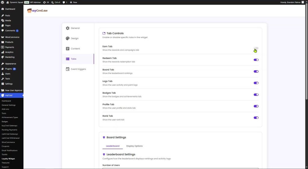
Tab Controls — seven tabs, each with an on/off toggle
| Setting | Description |
| Earn Tab | Shows the list of ways users can earn points (connected to Event Triggers). Default: ON. |
| Redeem Tab | Shows available redemption options (Points Gateway, Partial Payment, Coupons). Default: ON. |
| Board Tab | Shows the leaderboard ranking. Default: ON. |
| Logs Tab | Shows the user’s point transaction history. Default: ON. |
| Badges Tab | Shows the user’s earned badges and achievements. Default: ON. |
| Profile Tab | Shows the user’s myCred profile and balance stats. Default: ON. |
| Rank Tab | Shows the user’s current rank level. Default: ON. |
Only enable tabs for features you have active in myCred. If Badges are not configured in myCred → Badges, disable the Badges Tab here to prevent the tab from appearing to users.
Board Settings — Leaderboard
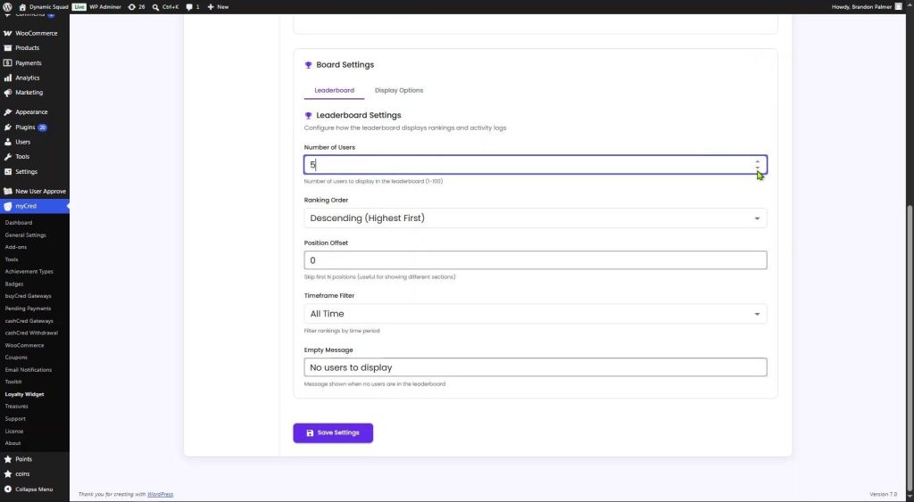
Board Settings — Leaderboard sub-tab with all configuration fields
| Setting | Description |
| Number of Users | How many users to show on the leaderboard. Enter any value between 1 and 100. Default: 10. |
| Ranking Order | “Descending (Highest First)” places the user with the most points at the top. “Ascending (Lowest First)” does the reverse. |
| Position Offset | Skips the first N positions. Entering 5 would start the leaderboard from rank 6 downward. Useful for showing segmented leaderboards. |
| Timeframe Filter | Filters the leaderboard by time period: All Time, Today, This Week, This Month, This Year. |
| Empty Message | Text shown when no users qualify for the leaderboard. Default: “No users to display”. |
Board Settings — Display Options
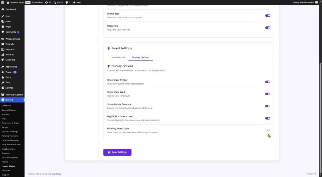
Display Options sub-tab showing all five toggle controls
| Setting | Description |
| Show User Avatar | Displays each user’s profile photo in the leaderboard row. Default: ON. |
| Show User Rank | Displays each user’s current myCred rank next to their name. Default: ON. |
| Show Points Balance | Shows the user’s current points balance in the leaderboard. Default: ON. |
| Highlight Current User | Visually highlights the row of the logged-in user so they can quickly find their own position. Default: ON. |
| Filter by Point Type | Adds a dropdown on the leaderboard allowing users to switch between point types (e.g. Points, Coins). Default: OFF. |

Front-end leaderboard showing ranked users with avatars, points, and the current user highlighted
Redeem Tab — Front-End Features
When a logged-in member clicks the Redeem tab in the widget, they see the redemption panel. This section explains each redemption method shown to the user.
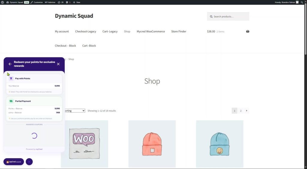
Redeem tab front-end showing Pay with Points, Partial Payment, and Awarded Coupons sections
Pay with Points (Points Gateway)
This section shows the user their current points balance and instructions on how to use their points at checkout.
| Setting | Description |
| Your Balance | Displays the user’s current points total so they can see how many points are available to spend. |
| Instruction text | Explains to the user that they need to select “Pay with Points” at checkout to use their balance. This method pays the entire order total using points. |
The Points Gateway method requires the myCred payment Gateway to be active and configured.
Partial Payment
Partial Payment lets users spend some of their points to reduce the total amount they pay — without having to cover the full order with points.
| Setting | Description |
| Points — Balance | Shows the user’s current balance for the primary point type. |
| Coins — Balance | Shows the user’s balance for additional point types (if multiple point types are configured). |
| Instruction text | Tells the user to apply their points for a partial discount at checkout. The remaining balance is paid through the normal payment method. |
Partial Payment is ideal when users do not have enough points to pay a full order but still want to use what they have. It requires the myCred WooComerce plus add-on to be active from myCred Toolkit Pro.
Awarded Coupons
The Awarded Coupons section displays WooCommerce coupons earned by the user through myCred reward actions. These are standard WooCommerce discount coupons — not myCred-specific coupons — and are applied directly at WooCommerce checkout.
| Setting | Description |
| What is shown | A list of WooCommerce coupon codes the user has earned. Each coupon includes the code and any applicable discount details. |
| How to use | Users copy the coupon code and enter it in the Coupon Code field at WooCommerce checkout, just like any regular coupon. |
Note: The Awarded Coupons section shows WooCommerce coupons assigned to the user as rewards. It does not display myCred’s own internal coupon system. Only WooCommerce-compatible coupons linked through the myCred Coupons add-on appear here.
Badges Tab — Front-End View
The Badges tab displays the achievements a member has earned through myCred. Badges are awarded automatically when a user reaches defined milestones (such as earning a certain number of points, completing specific actions, or maintaining streaks).
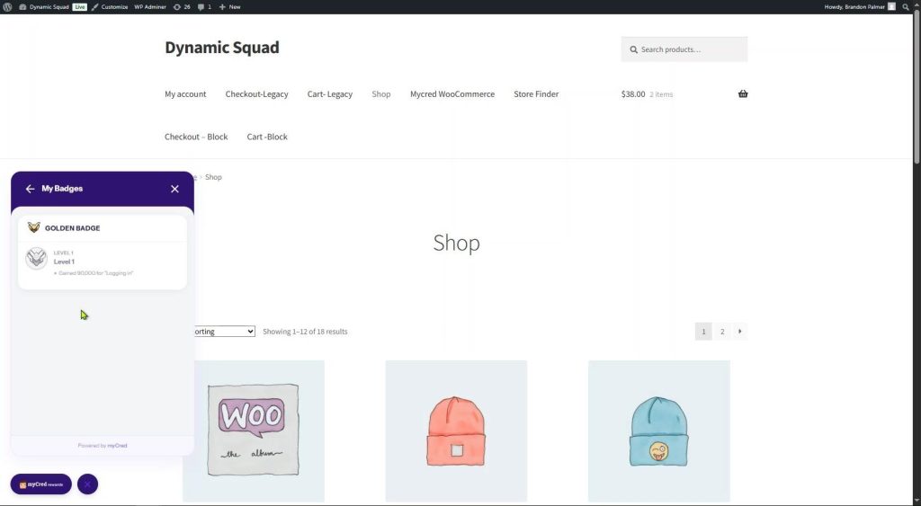
Front-end Badges tab — “My Badges” showing GOLDEN BADGE Level 1 earned for Logging In
Each badge card shows:
- Badge name: The title of the badge group (e.g., “GOLDEN BADGE”).
- Level badge: The specific level icon and label (e.g., “Level 1”) with its image.
- Achievement note: The action that earned the badge (e.g., “Gained 90,000 for ‘Logging in'”).
Badges must be created and configured in myCred → Badges before they appear in the widget. If no badges have been set up, this tab will show an empty state (“No badges yet — Complete actions to earn your first badge!”).
An empty badge state is shown in the Profile tab view when a user has not yet earned any badges. Once the user earns a badge, it appears here grouped by badge name and level.
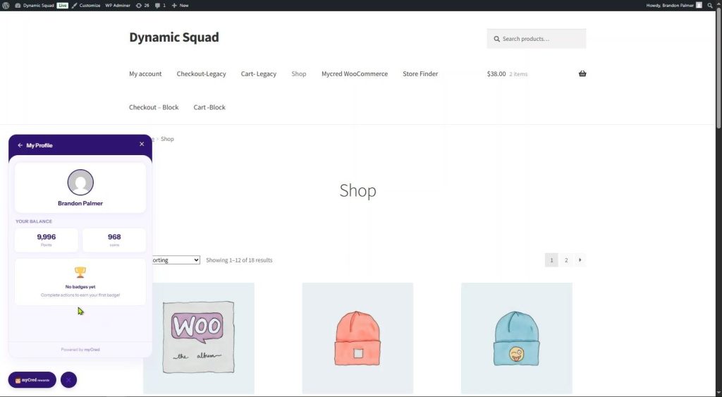
Profile tab showing user avatar, balance (9,996 Points / 968 Coins), and “No badges yet” empty state
Ranks Tab — Front-End View
The Ranks tab shows the user’s current rank as defined in myCred → Ranks. Ranks are assigned based on points accumulated over time and visually represent a user’s standing within the loyalty program.
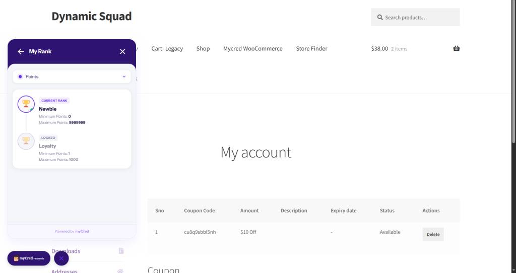
Front-end Ranks tab — “My Rank” view with point type selector dropdown
What the user sees in the Ranks tab:
- Point type selector: A dropdown (e.g., “coins”) allowing the user to view their rank for a specific point type. If only one point type is configured, this dropdown may not be shown.
- Rank level display: The user’s current rank name, icon, and level within that rank system.
- Progress indicator: Depending on your myCred Ranks configuration, a progress bar or threshold display may show how many more points are needed to advance to the next rank.
Ranks must be created in myCred → Ranks (or myCred → Points → Ranks) before they appear in the widget. Each rank can have a custom title, image, and points threshold. The widget automatically reflects the user’s current rank based on their live balance.
Event Triggers
The Event Triggers tab connects your myCred Hooks (automated point-reward actions) to the Earn tab in the widget. When configured, users can see exactly which actions earn them points, all within the widget panel.
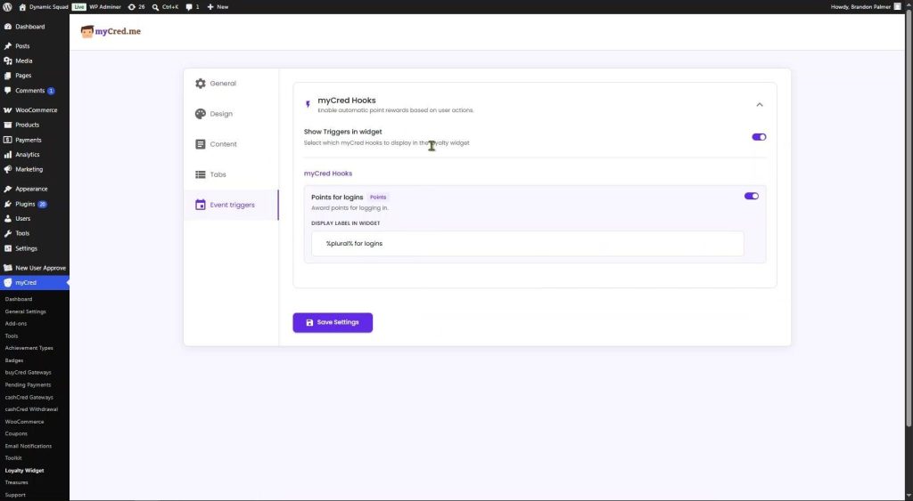
Event Triggers tab — myCred Hooks section with “Show Triggers in widget” master toggle
myCred Hooks
| Setting | Description |
| Show Triggers in widget | Master toggle. ON = the Earn tab lists all active and enabled myCred hooks. OFF = the Earn tab shows only the heading text with no action list. |
Below the master toggle, you will see every active hook from myCred → Points → Hooks. Each active hook on your site appears here automatically.
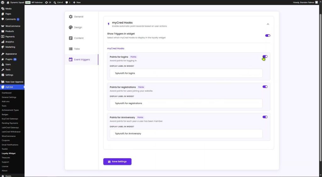
Individual hooks — Points for logins, Points for registrations, Points for Anniversaries — each with a Display Label field
| Setting | Description |
| Hook toggle | Per-hook ON/OFF switch. Toggle ON to include that hook in the Earn tab. Toggle OFF to hide it from the widget even if the hook is active in myCred. |
| Display Label in Widget | The text is shown next to the hook in the Earn tab. Supports myCred template tags. Default uses %plural% (your point type’s plural name) plus a description, e.g, “%plural% for logins” → “Points for logins”. |
Hooks are pulled directly from myCred → Points → Hooks. Any new hook you activate in myCred will automatically appear in this list. Toggle it ON here to display it in the widget Earn tab.
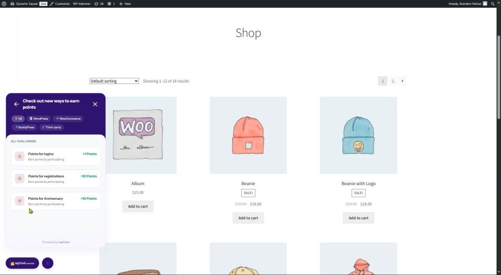
Front-end Earn tab — “Check out new ways to earn points” with filter tags (All, WordPress, WooCommerce, BuddyPress, Third-party) and challenge cards
Quick Reference
General
- Enable/disable the widget via the Status toggle. Enable/disable the widget via the Status toggle.
- Choose the corner position (Bottom Right default) and set pixel margins.: Choose corner position (Bottom Right default) and set pixel margins.
- Schedule with an optional Date Range (start/end date and time).: Schedule with an optional Date Range (start/end date and time).
Design
- Upload a custom logo or use the default myCred icon.: Upload a custom logo or use the default myCred icon.
- Set four colors: background, text, button, and button text.: Set four colors: background, text, button, and button text.
- Show or hide the “Powered by myCred” footer branding.: Show or hide the “Powered by myCred” footer branding.
- Configure launcher button corner radius and opening animation. Configure the launcher button’s corner radius and opening animation.
Content
- Customize all text separately for guests and members.: Customize all text separately for guests and members.
- Rename any navigation tab label to match your brand.: Rename any navigation tab label to match your brand.
- Set the heading shown at the top of each content tab.: Set the heading shown at the top of each content tab.
- Define redirect pages for Join Now and Sign In (guests only). Define redirect pages for “Join Now” and “Sign In” (guests only).
Tabs
- Toggle individual tabs on or off to match your active myCred features.: Toggle individual tabs on or off to match your active myCred features.
- Configure leaderboard: user count, ranking order, timeframe, empty message. Configure the leaderboard: user count, ranking order, timeframe, and empty message.
- Control leaderboard display columns (avatar, rank, balance, highlight, type filter).: Control leaderboard display columns (avatar, rank, balance, highlight, type filter).
Redeem Tab (Front-End)
- Pay with Points (Points Gateway): uses the full balance to pay an entire order at checkout.
- Partial Payment applies a portion of points to reduce the cart total.
- Awarded Coupons displays WooCommerce coupons earned as rewards (not myCred internal coupons).
Badges Tab (Front-End)
- Displays badges earned by the user, grouped by badge name and level.: Displays badges earned by the user, grouped by badge name and level.
- Badges must be configured in myCred → Badges before they appear here. Badges must be configured in myCred → Badges before they appear here.
Ranks Tab (Front-End)
- Shows the user’s current rank based on their accumulated points.: Shows the user’s current rank based on their accumulated points.
- Supports point type selector if multiple point types are configured.: Supports point type selector if multiple point types are configured.
- Ranks must be created in myCred → Ranks before they appear here. Ranks must be created in myCred → Ranks before they appear here.
Event Triggers
- Toggle “Show Triggers in widget” ON to populate the Earn tab. Toggle “Show Triggers in widget” ON to populate the Earn tab.
- Enable/disable each hook individually within the widget. Enable/disable each hook individually within the widget.
- Customize each hook’s display label using myCred template tags.: Customize each hook’s display label using myCred template tags.