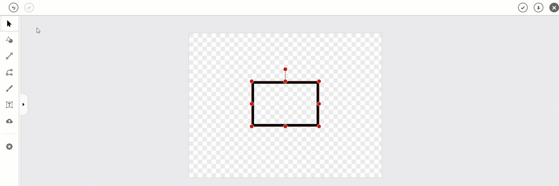
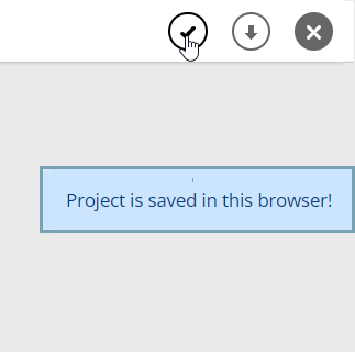
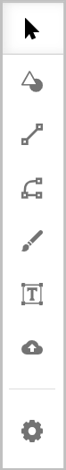
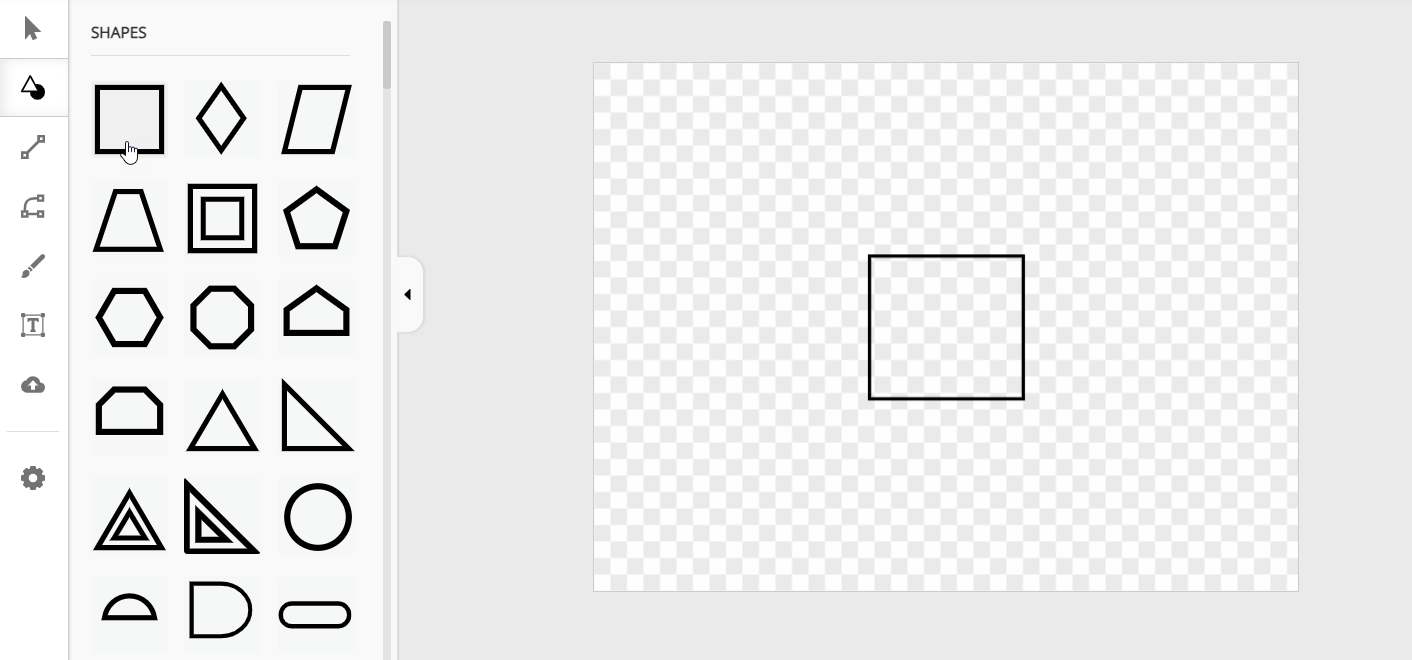
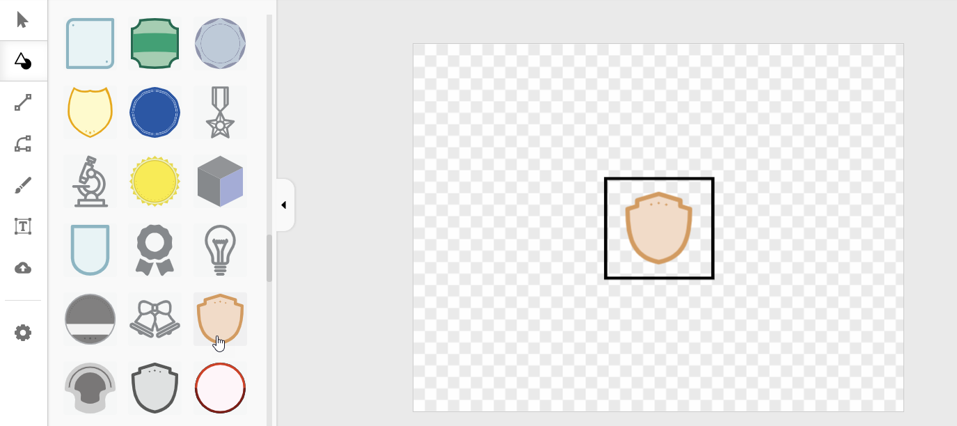
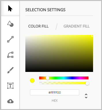
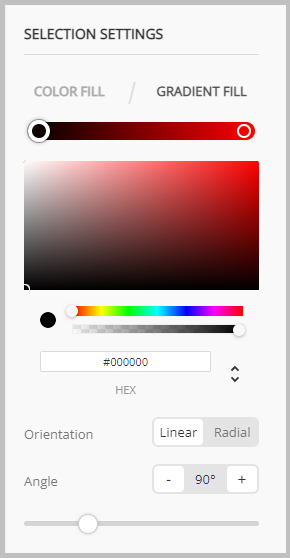
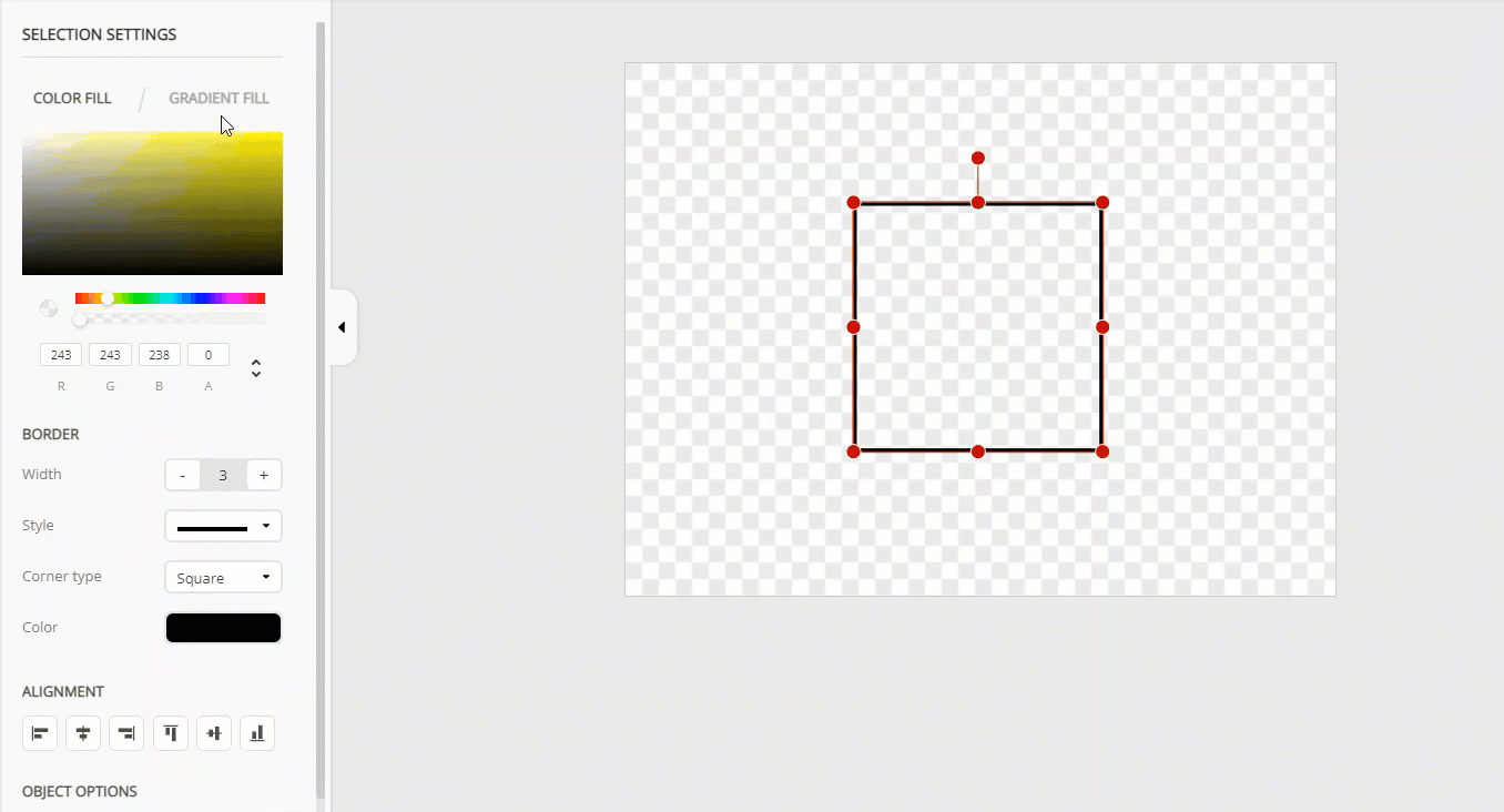
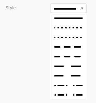
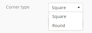
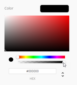
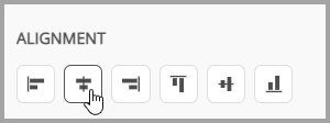
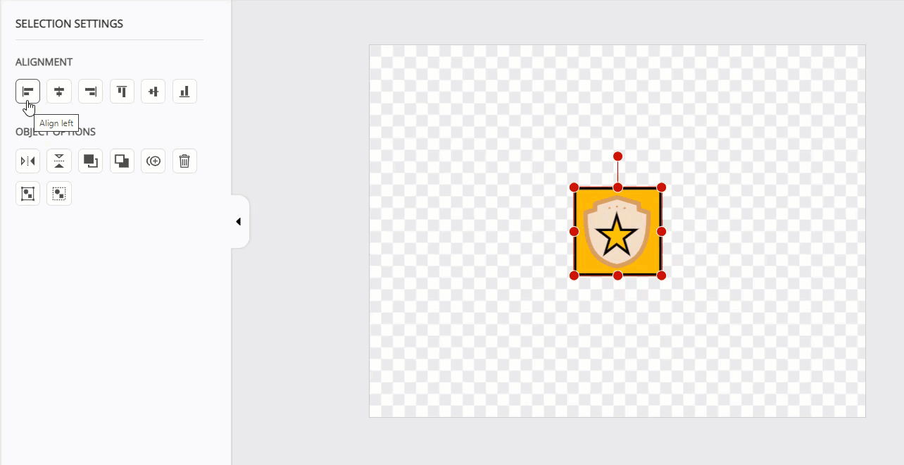
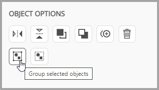
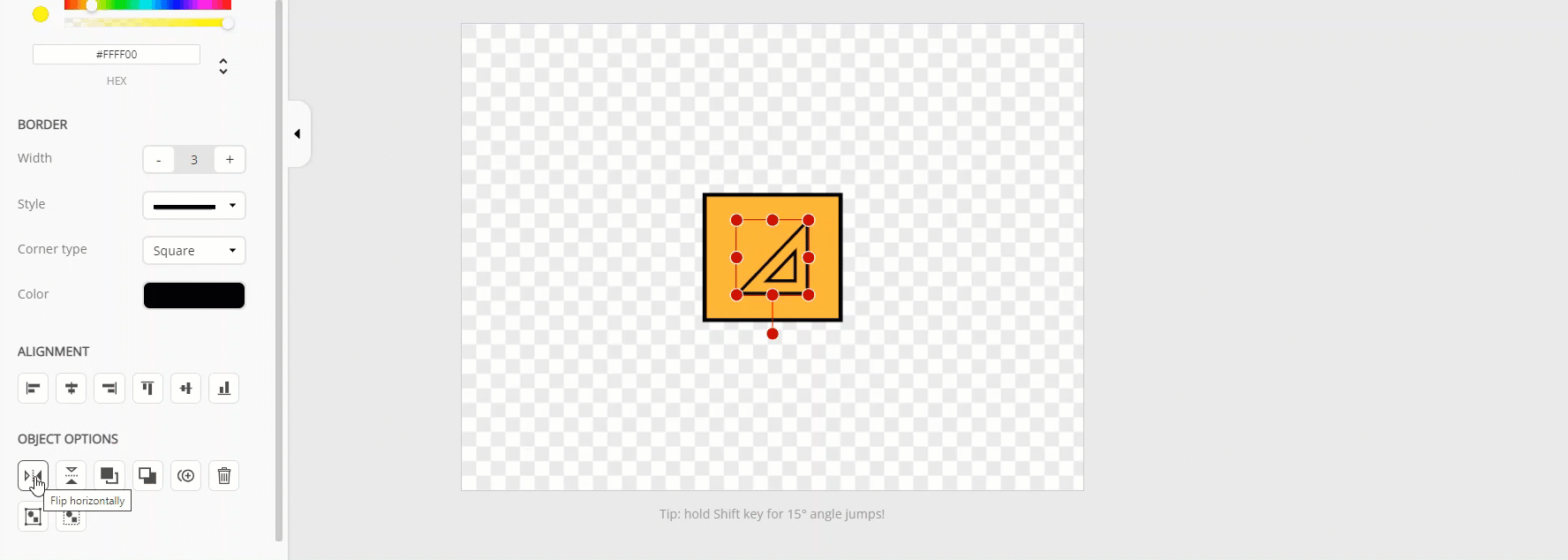
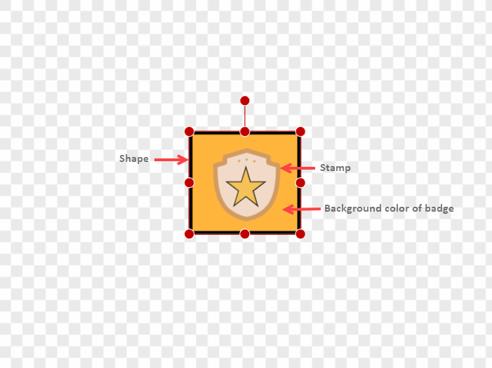
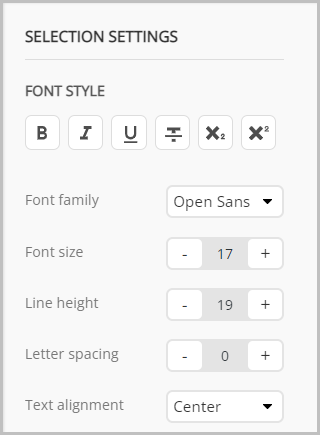
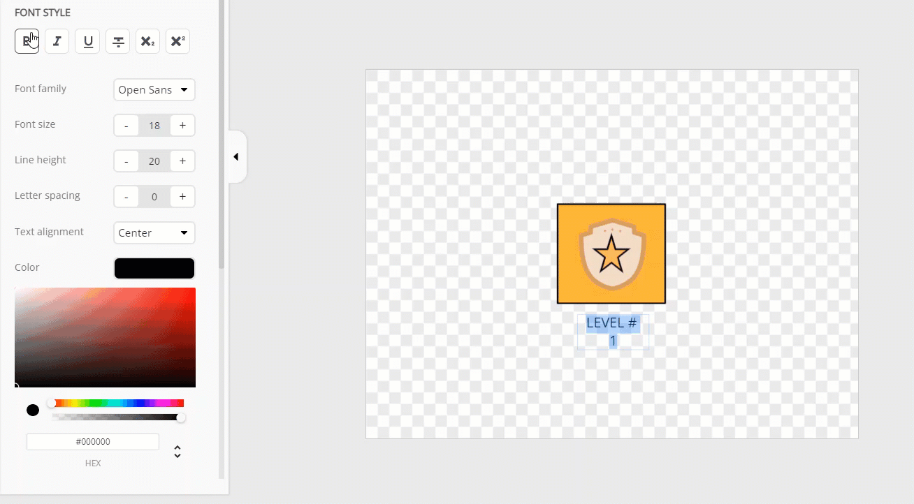
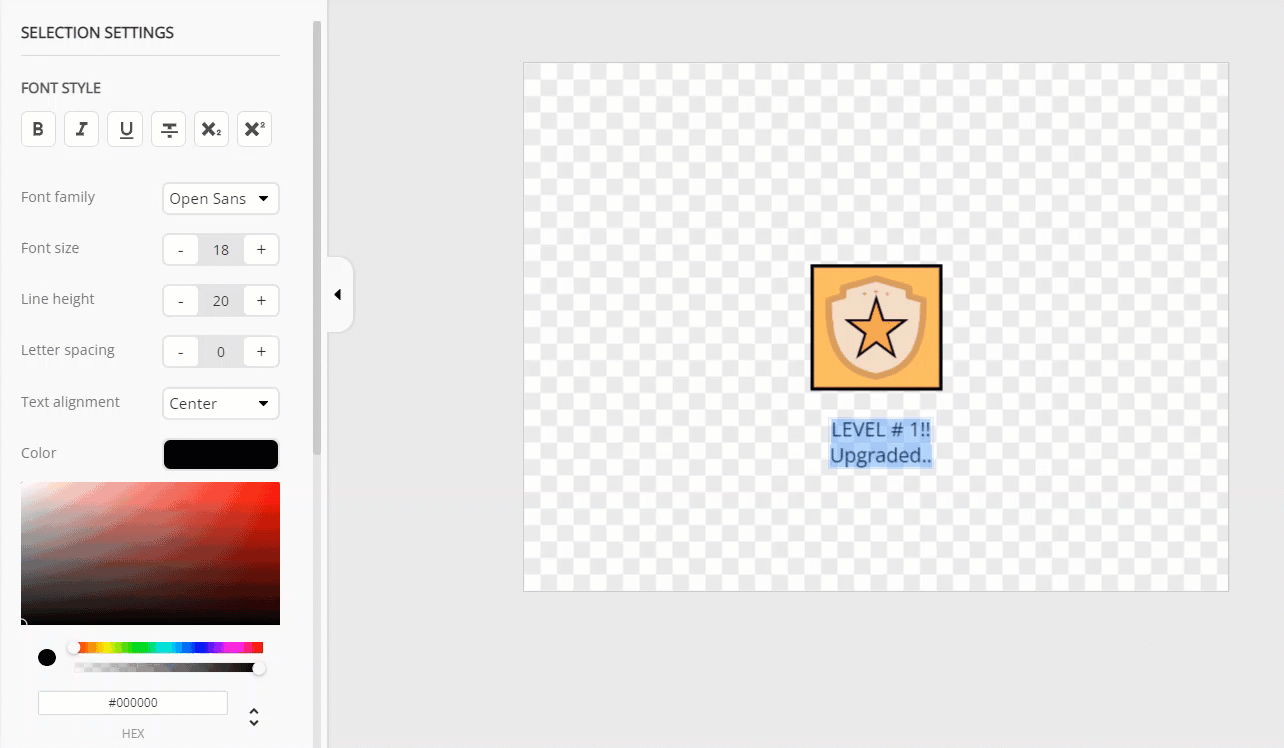
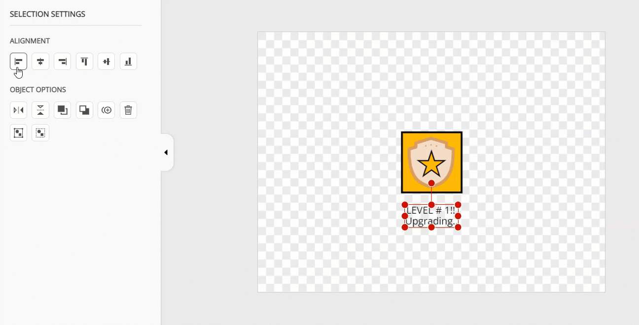
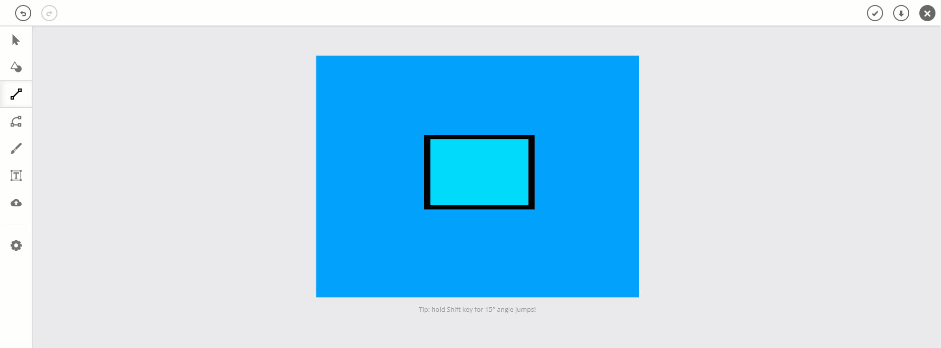
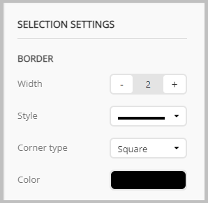
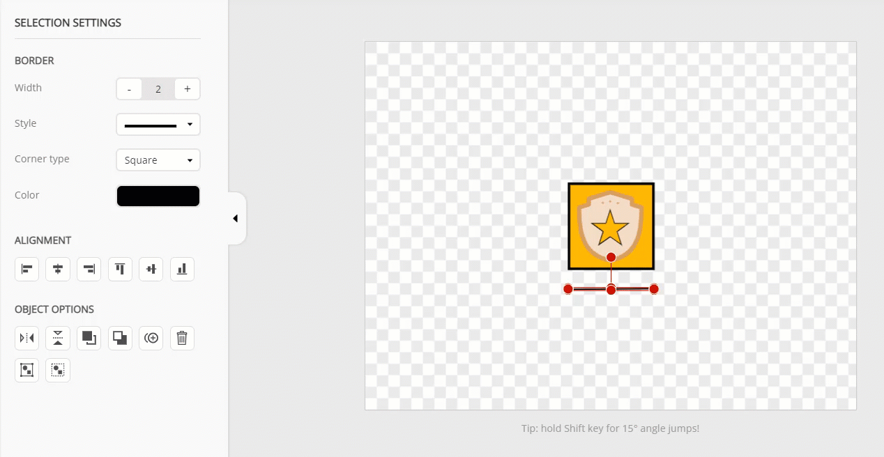
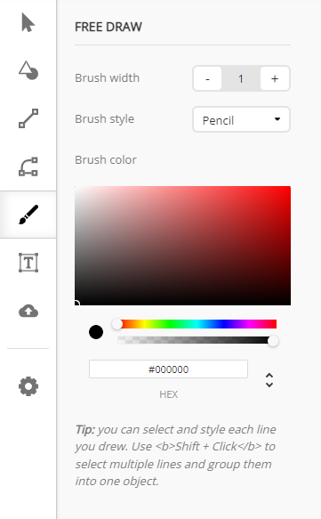
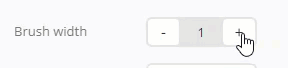
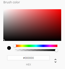
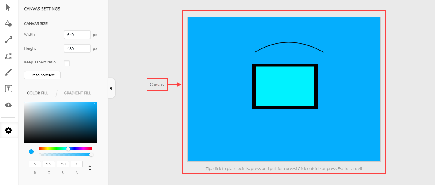
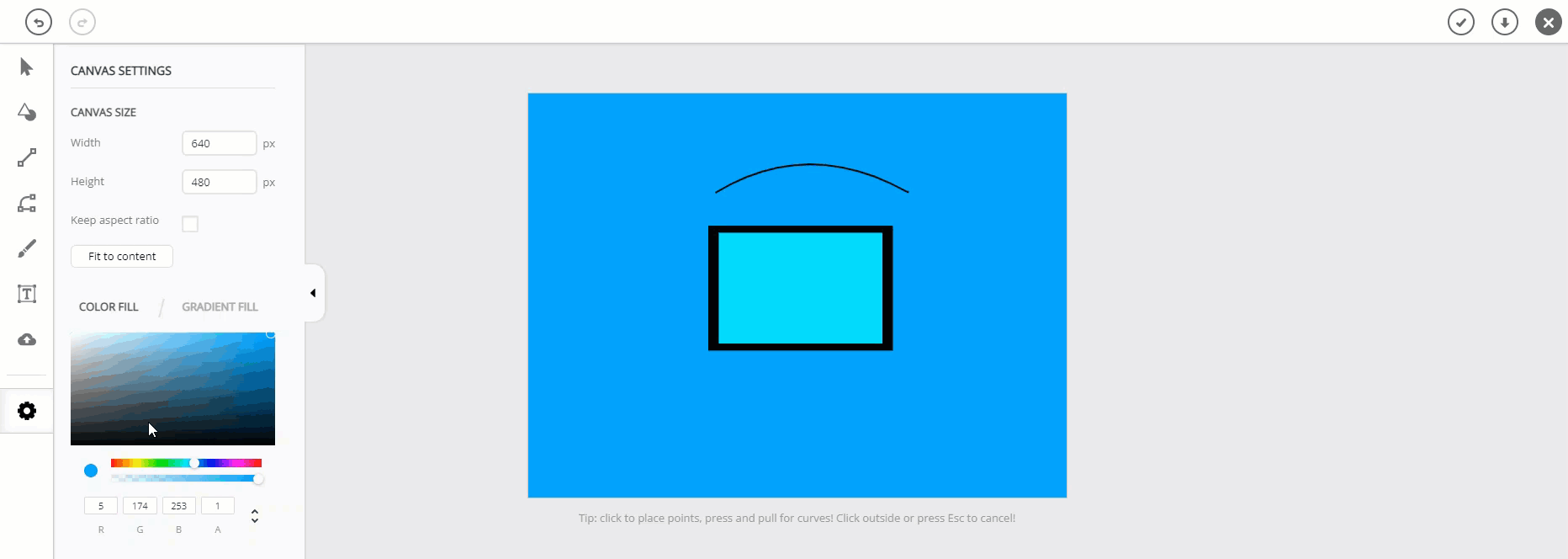
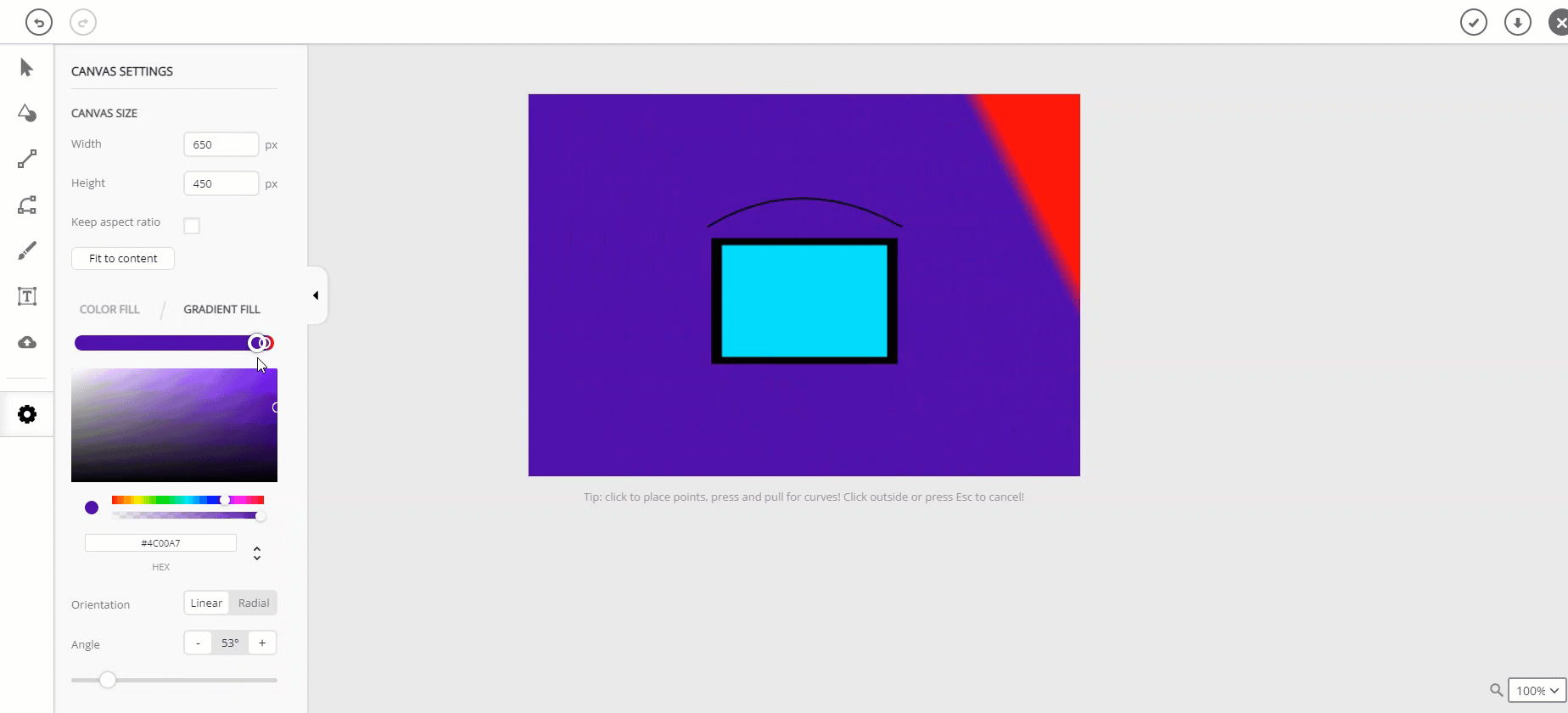
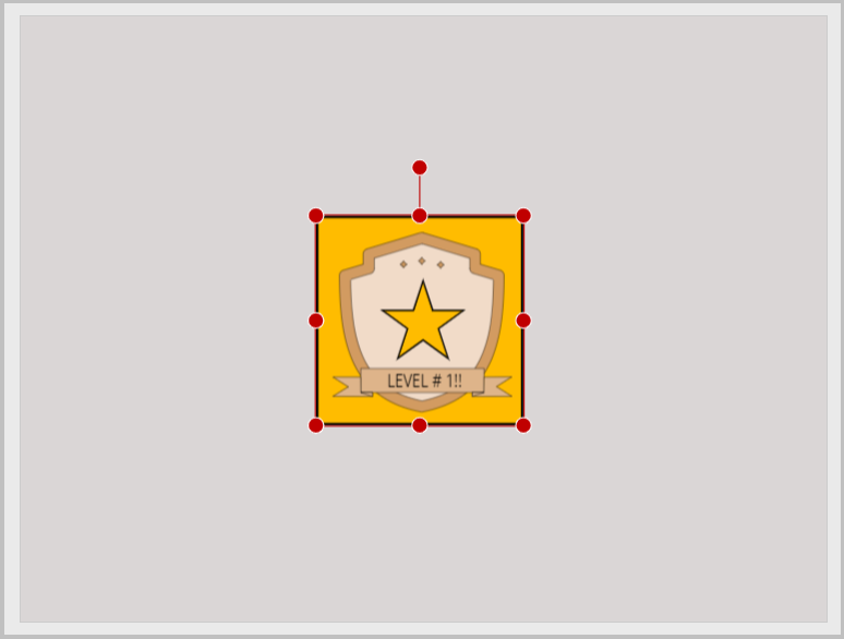
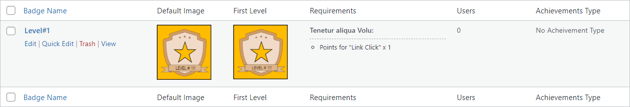
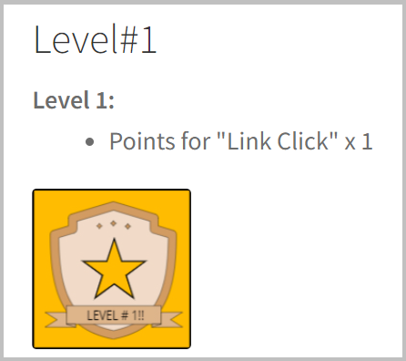
Badge Builder Interface Estimated reading: 10 minutes 2529 views Badge Builder Interface Badge builder is divided into three sections:Header.Toolbar.Canvas.HeaderIn the Header section, you will see the following buttons to save the badge as a draft or set as featured image. Save / Download ImageGo to the top left section of Badge Editor and click on the save option.This save function is used to save your project in the browser. The download function will provide you three formats in which the user can download the image.Download as SVGDownload as PNGDownload as JPG ToolbarThe Toolbar provides you multiple options to build or customize existing badges. Badge Icon/ShapeClick on the Shape icon in the toolbar.This option provides the user to select from multiple predefined shapes and customize it further as desired. To see Stamp shape-related options in the toolbar, click on the Shape and scroll down. NOTE: To change the color of a stamp, the user has to ungroup the stamp first then can change the color of each element separately. Badge CustomizationBackground ColorYou can set any color background for your badge according to your need. To change the Background Color, click on the badge and the Selection Window will appear in the toolbar. Color FillThe color fill effect in the shape works on a single color for the whole defined size. Gradient FillThe gradient color effect in canvas works on two color combination shades for the whole defined size. Click on the Gradient Fill to open gradient settings. Orientation Click on the Linear/Radial toggle button to select the Orientation. Linear: Distributes color in Linear formation and also provides an option of customizing angle for linear distribution of colors. Admin can also set the Angle in which they want to distribute color. b. Radial: It distributes color in Radial formation with center focus. Shapes BorderAdmin can customize the border Width of any shape needed. Admin can customize the border lines Style from the drop down menu. Admin can customize the Corner Type of shapes from the drop down menu. Admin can customize the border color from the Color section. Alignment Align Left is used to align the badge to the left most of the canvas.Align Center Horizontal is used to align the badge to the center horizontal of the canvas.Align Right is used to align the badge to the right most of the canvas.Align Top is used to align the badge to the top most of the canvas.Align Center Vertical is used to align the badge to the center vertical of the canvas.Align Bottom is used to align the badge to the bottom most of the canvas. Objects Options Flip Horizontal is used to flip the badge horizontally.Flip Vertical is used to flip the badge vertically.Bring Object Backward is used to send the object behind another object.Bring Object Forward is used to bring the object forward to another object.Duplicate is used to duplicate any object.Remove is used to remove any object.Group Selected Objects is used to group multiple shapes as a single object.Ungroup Selected Objects is used to ungroup a single object into sub shapes. Designed Shape Badge TextTo add text with a badge, click on Text Box in the toolbar. CustomizationThe Selection Settings panel will appear after clicking on the text written in canvas. Font styleBold Text is used to bold the text.Italic Text is used to give italic style to the text.Underline Text is used to underline the text.Line Through is used to line through the text.Subscript is used for subscripting the text.Superscript is used for superscripting the text. With the help of Font Family Admin can select any font style according to their requirements from the drop down menu.With the help of Font Size Admin can adjust the font size according to their requirements.With the help of Line Height Admin can adjust the line height according to their requirements.With the help of Letter Spacing Admin can adjust the line spacing according to their requirements.With the help Text Alignment Admin can align text from the drop down menu according to their requirements.Admin can set the Color of text from this color bar. Alignment Align Left is used to align the text to the left most of the canvas.Align Center Horizontal is used to align the text to the center horizontal of the canvas.Align Right is used to align the text to the right most of the canvas.Align Top is used to align the text to the top most of the canvas.Align Center Vertical is used to align the text to the center vertical of the canvas.Align Bottom is used to align the text to the bottom most of the canvas. Objects OptionsThese are the object settings for text.These settings work similar to shape objects settings mentioned above. Flip Horizontal is used to flip the text horizontally.Flip Vertical is used to flip the text vertically.Bring Object Backward is used to send the object behind another object.Bring Object Forward is used to bring the object forward to another object.Duplicate is used to duplicate text.Remove is used to remove any text.Group Selected Objects is used to group multiple objects as a single object.Ungroup Selected Objects is used to ungroup a single object into sub objects. Lines The myCred Assets builder provides Admin two types of Lines. Straight Line Click on the Lines icon in the toolbar.Hold and drag as per your required line length. It consists of the following customization option. To further customize the drawn line, click on the drawn line in the canvas.The Selection Settings panel will open. Line Border Admin can customize the Width of the line whenever needed. Admin can customize the Style of line from the drop down menu. Admin can customize the Corner Type of lines from the drop down menu. Admin can customize the line Color from the color section. Alignment Align Left is used to align the text to the left most of the canvas.Align Center Horizontal is used to align the text to the center horizontal of the canvas.Align Right is used to align the text to the right most of the canvas.Align Top is used to align the text to the top most of the canvas.Align Center Vertical is used to align the text to the center vertical of the canvas.Align Bottom is used to align the text to the bottom most of the canvas. Objects Options Flip Horizontal is used to flip the line horizontally.Flip Vertical is used to flip the line vertically.Bring Object Backward is used to send the object line behind another object.Bring Object Forward is used to bring the object line forward to another object.Duplicate is used to duplicate lines.Remove is used to remove any line.Group Selected Objects is used to group multiple objects as a single object.Ungroup Selected Objects is used to ungroup a single object into sub objects. Connectable Lines and CurvesClick on the Connectable Lines and Curves icon in the toolbar.Hold and drag as per your required line lenght, press and then pull for a curve in line in your required direction.Press ESC to end the line. To further customize the drawn line, click on the drawn line in the canvas.The Selection Settings panel will open. Line BorderAdmin can customize the Width of the line whenever needed. Admin can customize the Style of line from the drop down menu. Admin can customize the Corner Type of lines from the drop down menu. Admin can customize the line Color from the color section. Alignment Align Left is used to align the text to the left most of the canvas.Align Center Horizontal is used to align the text to the center horizontal of the canvas.Align Right is used to align the text to the right most of the canvas.Align Top is used to align the text to the top most of the canvas.Align Center Vertical is used to align the text to the center vertical of the canvas.Align Bottom is used to align the text to the bottom most of the canvas. Objects Options Flip Horizontal is used to flip the line horizontally.Flip Vertical is used to flip the line vertically.Bring Object Backward is used to send the object line behind another object.Bring Object Forward is used to bring the object line forward to another object.Duplicate is used to duplicate lines.Remove is used to remove any line.Group Selected Objects is used to group multiple objects as a single object.Ungroup Selected Objects is used to ungroup a single object into sub objects. Badge Free DrawmyCred Badge Editor also provides Admin to do freestyle draws as per their requirements.Click on the Brush icon in the toolbar. Select your desired Badge Width for creating freestyle badges. Select your desired Brush Style for creating and designing the freestyle badges. Select your desired Brush Color for creating a freestyle badge. Image Upload Admin can upload the image in Badge Editor by using the Image Upload option. Navigate to the Assets Builder → Toolbar → Image Upload.After uploading, Admin can customize the badge according to their need. CanvasCanvas provides you the instant preview of your badge so you can see how the final badge looks like.Click on the Settings button in the toolbar. Canvas SizeCanvas Size consists of following features: Height / WidthEnter your desired Height/Width of your canvas in pixel. Aspect RatioIt is used to set the image height and width. Fit to Content:It is used to set your badge height and width automatically according to the user defined canvas size. Color Fill / Gradient FillIt consist of following options of customizing; Color Fill:The color fill effect in canvas works on a single color for the whole defined size.Gradient Fill:The gradient color effect in canvas works on two color combination shades for the whole defined size.It consist of further more features mentioned below Orientationa.LinearDistributes color in Linear formation and also provides an option of customizing angle for linear distribution of colors.Admin can also set the Angle in which direction they want to set color. b.RadialIt distributes color in Radial formation with center focus. Designed Badge Save And Upload the BadgeAfter the user is done with the badge design.Go to the top right corner of the Header and click on the Download button.After downloading, navigate to the WordPress Admin Dashboard → myCred → Badges.Click on the Add New and upload the designed badge.Set-up your Badge and click on Publish to save the badge. Front-End Impact


